|
|
|
|
| ||||||||||||||||||||||||||||||||||||||||||
|
Hardware |
|
Software |
|
Human- |
||
|
|
User |
|
Figure 1: Human-Computer Interface (from Bo, 1982)[i]
The hardware components used were: I had three input devices to enter information into the computer: a scanner, a keyboard and a mouse. I had only one output device: a computer that drove a display device (meaning a screen) but I didn’t have any sound. I had two interaction devices: a keyboard and a mouse.
I’ll explain a little about what software components are. There are three types of software component: data structures, the application program and the graphics system:
Data structures are important components of
software. Data structures hold the description of the object whose picture is
going to appear on the screen. Graphics data structures can be divided into
those that store graphics information in display memory, and those that store it
in command-data files. Raster files or bitmapped (BMP) files contain graphics
information described as pixels, e.g. already rendered vector drawings or
digitised video images or photographs. Animations are usually collections of
raster data that are displayed in a sequence. This is because rasters display
quicker, because the system does not have to store or convert between commands
and data. However the system is less flexible in terms of modification at
runtime, e.g. to move a square you’d have to erase and redraw the edges.
Vector files, in comparison, contain data described as mathematical equations
and are typically used to store line art and computer aided design information.
A vector drawing means that the graphics drawing is rendered at runtime from a
file of drawing commands. It has the advantage that the drawing file is small,
and the actual drawing can be modified at runtime to suit various requirements.
Such a dynamic data structure with commands or operations could allow the user
to point to the square, and then drag it to the new position. Another vector
drawing feature is the ability to select a number of draw objects and make them
into a group that can then all be edited at one time.
The second component of software is what application programs you are using. This is important because most graphics files only contain static data and not executable code[1]. The code that reads, writes, and displays graphics data is found in translation and display programs and not in the graphics files themselves. By definition graphic application programs describe the geometry of the object whose picture is to be viewed on the view surface. They often also have display tools (high-level language output and plotting subroutines for specific output devices that make them display the picture) and image processing tools, e.g. to set blocks within a GIF file to a “transparent” (i.e. the background) colour. The application programs I thought I’d use to make my animation were:
Ø Adobe Photoshop version 5
Ø Micrografx Picture Publisher version 6.0a
Ø Microsoft Paint in Windows 98
Ø GIF Construction Set Professional version 2.0a
Ø Microsoft PowerPoint 2000
The graphics system is perhaps the most important component of software. Without graphical human-computer interfaces, using software requires knowledge of command strings (e.g. to pass user input data to the application program) and device-dependent parameters (e.g. conditions of the display processor or the coordinate system of the physical screen), so the process of using the software would require programming skills. Interaction techniques are ways to use input devices to enter information and make up user interfaces. While the data structures need not follow the user’s thinking, the interface must, e.g. the mouse presents few problems in pattern recognition for most people. There’s an interactive user-computer dialogue to allow the user to specify how to construct and modify objects, indicate which views are to be displayed, start a procedure corresponding to an item on a menu, etc. The interaction technique is crucial for performance. In one study (English et al., 1967)[ii] 100% differences in speed and 200% differences in error rates were found between different techniques for selecting displayed words.
So on what criteria am I going to critically analyse the
human-computer interaction of these applications? I’ll use a language analogy to determine
suitable criteria. The user-computer
dialog is similar to language in that with one interface the user communicates
to the computer (by acting on interaction devices). With another interface, the
computer communicates to the user (graphically through lines, colours, etc.)
Note, To make an accurate comparison of the software I would need an
objective study of the user (Moran, 1981[iii];
Caroll & Thomas, 1982[iv])
rather than basing judgments on folk psychology. Claims of simplicity,
naturalness or ease of use of new computer systems, languages or techniques have
not been confirmed experimentally (Shneiderman, 1980)[v].
Compatibility
means that user input and expectations of computer output are consistent
with the user’s model of the world, e.g. red buttons are more dangerous to
press than green. A compatible system reduces the amount of information recoding
required of the user. Graphical icons representing menu selections are often
more compatible with users because visuo-spatial cues aid recognition & the
search process now parallels real-space searches for real objects.
Usability
is dependent upon the "context of use", that the usability of a piece
of software is influenced by the specific tasks, users, hardware, physical and
social work environment, etc.
The
semantics are objects and operations of the domain of discourse.
The output semantics include the state of the picture. Consistency here means
that operations that can be performed on a class of objects should be
generalisable to similar classes of objects. Good user interface design
depends on topics such as when to use direct manipulation, metaphors, pointing
and selecting, etc.
The system is learned, so concepts should be kept familiar to aid learning. I am using Windows applications programs, so Microsoft standards for graphical user interfaces should be used regarding areas of the display, resizable screen areas, widgets. Direct manipulation was expected. I expect to create and user-define a nested structure containing an face and a mouth out of dynamic object oriented data structures, view both the way the picture looks and the relations between objects, edit components of the meta-object individually and modify properties, and create many examples of this object.
Lexicon
is the entire set of morphemes (smallest meaningful unit) in a given language
and the language should be complete so you can do what you want to do within the
domain of discourse. The input lexicon includes clicking commands on the menu,
while the output lexicon includes line-thickness, font or colour of filled
regions..
The
language should be efficient so you can command the computer effectively and
concisely. One study (Card et al., 1980)[vi]
showed the speed with which experienced users can input commands is proportional
to the number of steps, keystrokes or hand movements required.
Syntax
is the order in which commands must be made and what inputs you have to provide.
Spatial and temporal factors are important, e.g. the organization and coding of
visual information on screens, the arrangement of menus, etc.
Reisner
(1981)[vii]
found people make fewer errors if syntactic structures are simple. The number of
steps in a command dialog should be small. Demands on short-term memory should
be minimised. What you have to do should be self-evident.
Icons, menus, forms, etc. are different because
they’re recognised, not recalled. They
should be descriptive.
Items
should be consistently placed to aid motor and short-term memory, e.g. similar
information should be in the same general display location.
Pragmatics
is the function and appropriacy of language. We sometimes speak to check the
other understands, or to show we’re listening.
Simple
and frequent interactions should have an almost immediate response. Computer
graphics systems’ users are often engaged in tasks requiring a high degree of
concentration and creativity. Under these conditions people tend to become
impatient after only a couple of seconds. Response times should be consistent.
An example of irritating irregular response times is buffered writing text where
you think you haven’t typed anything and then at random intervals the typed
characters are written to the screen in bursts.
Users
need feedback. Lexical feedback is when input lexical action is responded to by
a lexical response in the output language, e.g. changing cursor type when you
mouse click. Syntactic feedback includes telling the user commands have been
understood e.g. highlighting a pressed button, asking for input. Semantic
feedback includes saying the requested operation has finished, the program is
busy, giving the user some idea of what they’ve just asked to be done, e.g.
with partial results, etc.
The
language should be appropriate for both novice and experienced users. There
should be on-line tutorials for the novice, manuals and help systems. Any
information, beyond the regular task dialog that is provided to the user on
request or is automatically provided by the system, aids users in achieving
desired results. The types of on-line help systems, feedback information, error
management (messages and dialogs associated with errors and malfunctions),
prompting e.g. with a blinking cursor or explicitly with instructions are
important. It should be possible to invoke help, status and cancel
at any time, always with the same mechanism, and to return to the same state as
when help was called. There should be an option of more detailed information for
the motivated user who will invest time. There should be no flaws to cause the
unmotivated user to complain or give up. Fast menu selection and dialogs with
many alternatives and terse command language (minimising steps per goal) are
more important for the experienced user. The stressed user needs simplicity so
work can be done by instinct or reflex.
Users
need to be able to backtrack from mistakes. Semantic backup would be to be able
to return to your exact starting position, or to pick a different button after
you’ve already picked one.
The computer (as in the listener) should be able to use context to make inferences, e.g. to resolve ambiguities. Help should be dependent on the current state.
At each step of the way, I considered what application data structures (representing objects and relationships within and between objects) I would need to manipulate and view. I considered logical and temporal relationships between objects and their pictures. In my case, the user deals with one picture at a time (i.e. the paint systems). There’s also structured collections of objects, hierarchies of assemblies and subassemblies (e.g. the face remains steady while the mouth moves). Then there’s a time varying sequences of related pictures (i.e. the cartoon animation). After doing this I’d choose the appropriate software for that data structure.
In terms of geometric description, I had to first describe the objects to the graphics system so that it could display the visual rendering of the geometric properties of objects being modelled and also represent the non-geometric properties of the objects, like the face and mouth being separate objects. My associated object attributes were line thickness, colour, size, texture and position, which had to be controlled across animation frames. So I converted from dynamic vector data structure to bitmap to GIF. For the final product, the GIF format was chosen because of its advantages in terms of (1) size, (2) transparency and (3) speed of view. (1) The GIF (Graphical Interchange Format) file format stores bitmap data compressed using the LZW algorithm and is used for the storage and on-line retrieval of bitmapped data. A GIF file consists of a screen colour map and a series of images, each with an optional colour map. The images don't have to be at the origin and can be any size smaller than the screen size so only the part of the screen that changes need be updated. (2) You can set certain pixels within the bitmap to a "transparent" colour, meaning Web browsers will display these pixels with the same colour as the background colour of the display device. This stops the rectangular borders associated with most bitmapped images that appear on a Web page. (3) Interlaced GIFs allow the user to recognise the image before all the bitmapped data has been received. Non-interlaced images paint linearly from the top to the bottom of the display image, so when half of the data has been received you can only see the top half of the picture. Interlaced GIFs paint quickly over the entire display first as a very low-resolution image, then repaint the image in three more passes with each pass supplying more resolution. The user can often recognise the picture long before all of the data has been received.
I made 2 animated gifs, one from bitmaps and one from vector data structures, to compare the functionality of the different software programs.
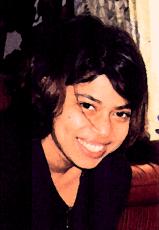
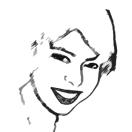
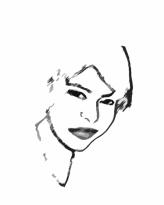
For the first animated gif the objective was to use photos to make an animation of my face smiling then looking sad.
|
1.
First I had to scan in a photo of me smiling. Micrografx Picture Publisher
had the most intuitive instructions for acquiring images, though PhotoShop
had the facility too. |
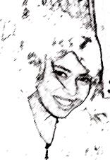
2. Then I used PhotoShop to turn it into black and white line art. PhotoShop had the most options in terms of colour and drawing transformations. |
3. Then I used Paint and PhotoShop to clean it up: |
|||
|
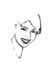
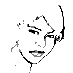
4. I used Paint to erase parts of the mouth and draw it smiling less. |
5. Then I scanned in a photo of my lips sad. I used Micrografx Picture Publisher because I could find the crop button. |
6. I made the black and white in Photoshop, then cut the mouth out and stuck it on the previous Paint face |
|||
|
7. I used Paint to erase parts of that mouth to make it more smiling. |
|
|
Finally, I changed the files to small black and white
GIFs (with poor resolution to reduce size) in PhotoShop. I set the background to
transparent, made the GIFs interlacing and made the final animation in Gif
Construction Set. The final animated GIF was only 11KB. Here is the final
animated GIF:
For the second animation, I wanted to make a home page Banner. I wanted to have “Welcome to Shamim Khaliq’s Home Page” written on it, and have orange flowers open up in an ellipse around the title.
|
1. For anything geometrical or involving words PowerPoint is best. First an ellipse was drawn around a WordArt title. The words were centred and grouped with the ellipse. Markers were added where the flowers would go. |
2. Pictures of flowers opening were obtained by converting animated GIFs into their composite GIFs using Gif Construction Set. 3. The colours of the GIFs were changed to the ones I wanted using PhotoShop, the best software for modifying photos. 4. The flowers were put onto PowerPoint slides to make a sequence. Unfortunately, even with PowerPoint grids, pasting the flowers onto their exact places in the grids was very difficult, and in the end one slide had to be discarded. 5. The size, resolution, & number of colours used were minimised using PhotoShop. Even so, the final product was 56KB big. |
||||
|
1.
|
5.
|
||||
|
2.
|
6.
|
||||
|
3.
|
7.
|
||||
|
4.
|
8.
|
||||
|
Here is the final animated GIF at 56KB:
|
|||||
I’ve had Photoshop a long time and I’m only just discovering how to do things. It’s a frustrating program for novice, or even intermediate-level users. Any of the Microsoft Office applications are easy to use if you’ve used Windows. Micrografx Picture Publisher is also easy to use because of limited functionality and Windows style buttons.
Within their micro-domains of specialisation, I thought each program was a good example of that type of program. Photoshop and Picture Publisher seem to be mainly for working on photos. Paint is for drawing. PowerPoint is for centring, aligning, grouping. Picture Publisher and PowerPoint can do text. GIF Construction Set is for animated GIFs. The slide-metaphor used by PowerPoint made animation easy. One thing that was lacking in all the software I used, that would have made animation of multiple objects grouped together much easier, was a grid that shapes could snap onto. Visio Professional has this facility (but I didn’t use it for the two pieces of design I’ve submitted). PhotoShop had a lovely record and play a set of commands, which looked like a cassette player and allowed me to perform the same actions on a set of images.
Only PowerPoint gave me the group, ungroup, align, etc. options. They all provided a Windows-type interaction.
In terms of making animations, no graphics software was complete. I had to keep switching from one to the other because each had its strengths and weaknesses. Microsoft Paint probably has the least completeness, being very limited in what it can do. PhotoShop is probably the most complete, because every time I use it I find out something new I can do.
PhotoShop is the worst on efficiency for the novice. In frustration you end up trying every item on the menu to try and get the outcome you want. And once you can do something, you can’t remember how you did it because the process was so complex. For example, to set the background transparent (which is simply “click on the area you want to make transparent” in GIF Construction Set) in PhotoShop you have to click on a button somewhere on the left, then export to GIF, and something else. GIF Construction Set was not very efficient on common commands, like “open file” because there were no buttons and you had to go to the menu bar.
Paint
has so few functions you can have buttons on the screen for most of them, and
mouse moves for the rest.
I didn’t need to look constantly between the work and
message area in any of the graphics applications. Status messages too were
predictable.
Keyboard characters, like enter or space had predictable results, and you could ever transfer from one program to another easily with keyboard control c and control v. Only GIF Construction Set wouldn’t accept the usual key functions.
They all had redundancy built
in; which reduced user workload. PhotoShop less so, but I think it was trying to
reduce visual
clutter with selective displays. Zoom
only gave me an idea of where in the picture I was in PhotoShop.
The naming convention and abbreviations were appropriate in all the programs apart from PhotoShop, which used words like sumi-e because it had so many effects.
PhotoShop
was poor on visual coding of buttons. The menu with the familiar crop
symbol, present in every other graphics program, was hard to find. On the good
side, PhotoShop has many numeric fields you can play with, and does tend to give
you graphical number controls. Attention was directed by cues by all the
software.
Items
were consistently placed to aid motor memory in all but Photoshop, where I lost
buttons I had just pressed. I think it keeps hiding and changing menus, with
different menus in different places. I’m not quite sure what the grouping on
either of PhotoShop’s or Picture Publisher’s menus or bars is yet.
PowerPoint, like Word, lets you create your own menus and groups so it makes
sense to you personally, though it can take some time to set it up.
Paint
was always very fast, but it let me do irreversible things too quickly and
without warning for me. The other graphics programs were slower, but the systems
always responded immediately to my action even if it was just to acknowledge it.
After acknowledging my action, no more than 3-6 seconds ever passed before the
systems updated me as to the status of the requested action. Only PhotoShop
provided adequate feedback on what I was about to do through previews, at the
cost of speed.
PhotoShop
had terrible help files for the novice. It was too technical, and filled most of
the page so you forgot what the problem was while trying to read it. When I
tried to follow instructions key interactions could not be found, and when I did
find out how to do it by trial and error it could be in a different way than
that described in the help file. But as an intermediate-experience user I keep
finding quicker ways of doing things via the menus, which have more options on
them. PowerPoint guides the novice with templates and help, and doesn’t
clutter the environment for the experienced user. GIF Construction Set doesn’t
permit you to ask for help in the middle of an interaction, so you have to
cancel whatever you’re doing to look for help.
All
the software allowed trial positions in a drag, and hovering over a button and
having it highlighted. As PhotoShop easily allowed multiple copies of files, I
could undo commands even when the file had been saved. It was too easy to
overwrite files without recourse for backtracking in the other programs.
All the software had clear cancellation procedures, you know you can cancel until which command and how much will be cancelled. Paint only seemed to remember 3 steps back, and Picture Publisher only one. Irreversible operation buttons should not be next to frequently used reversible operation buttons, e.g. a simultaneous right and left mouse click in Paint irreversibly erased the last action.
Toolbars in PowerPoint would appear appropriately, e.g. if
you clicked on a picture.
Help called while the system’s waiting for a command should explain what
options you have. GIF
Construction Set sometimes had a help button while you were choosing a command,
and help did seem pertinent if called. Photoshop & Picture Publisher rarely
had a help button mid-command, so when help was called it was in general the
index of help files. This caused a problem in trying to recognise what the
keywords for my problem might be.
The only thing this software is really suited to, regarding animations, is modifying photos and making animations out of pre-prepared GIFs. In none of the software was it easy to fix composite parts of a picture to prespecified places. As I tried some animations with lots of movement and found them difficult to read, I settled on flowers blooming in their place, which proved very difficult to do (not impossible because of PowerPoint and Visio). My ideal website banner would be a transformer (that children’s cartoon and toy?) transforming from one appearance to another. Although I have access to lots of pictures of transformers, I felt this to be out of my scope with the software I have available. I suspect 3-D modelling is what I’m after.
![]()
[1] Though some new multimedia formats allow executable instructions to be stored within a file format by interfacing with their environment via an API or interacting directly with the operating system, e.g. to instruct multimedia applications to play sounds or ask the user for information... A truly object-oriented graphics file might contain the code required to read, write, and display itself.
![]()
[i] Bo, K. (1982). Human-computer interaction. IEEE, 15(11), 9-11.
[ii] English, W. K. Englebart, D. C. & Berman, M. L. (1967). Display-selection Techniques for Text Manipulation. IEEE Trans. on Human Factors in Electronics, HFE-8(1), 21-31.
[iii] Moran, T. P. (1981). An applied psychology of the user. Computing Surveys, 13(1), 1-11.
[iv] Carroll, J. M. & Thomas, J. C. (1982). Metaphor and the cognitive representation of computing systems. IEEE Transactions on Systems, Man, and Cybernetics, 12(2), 107-115.
[v] Shneiderman, B. (1980). Software Psychology: Human Factors in Computer and Information Systems. Cambridge, MA: Winthrop.
[vi] Card, S., Moran T., and Newell, A. (July 1980). The Keystroke-Level Model for User Performance Time with Interactive Systems. Communications of the ACM, 23(7), 396-410.
[vii] Reisner, P. (March 1981). Formal Grammar and Human Factors Design of an Interactive Graphics System. IEEE Trans. on Software Engineering, SE-7(2), 229-240.
![]()
|
|